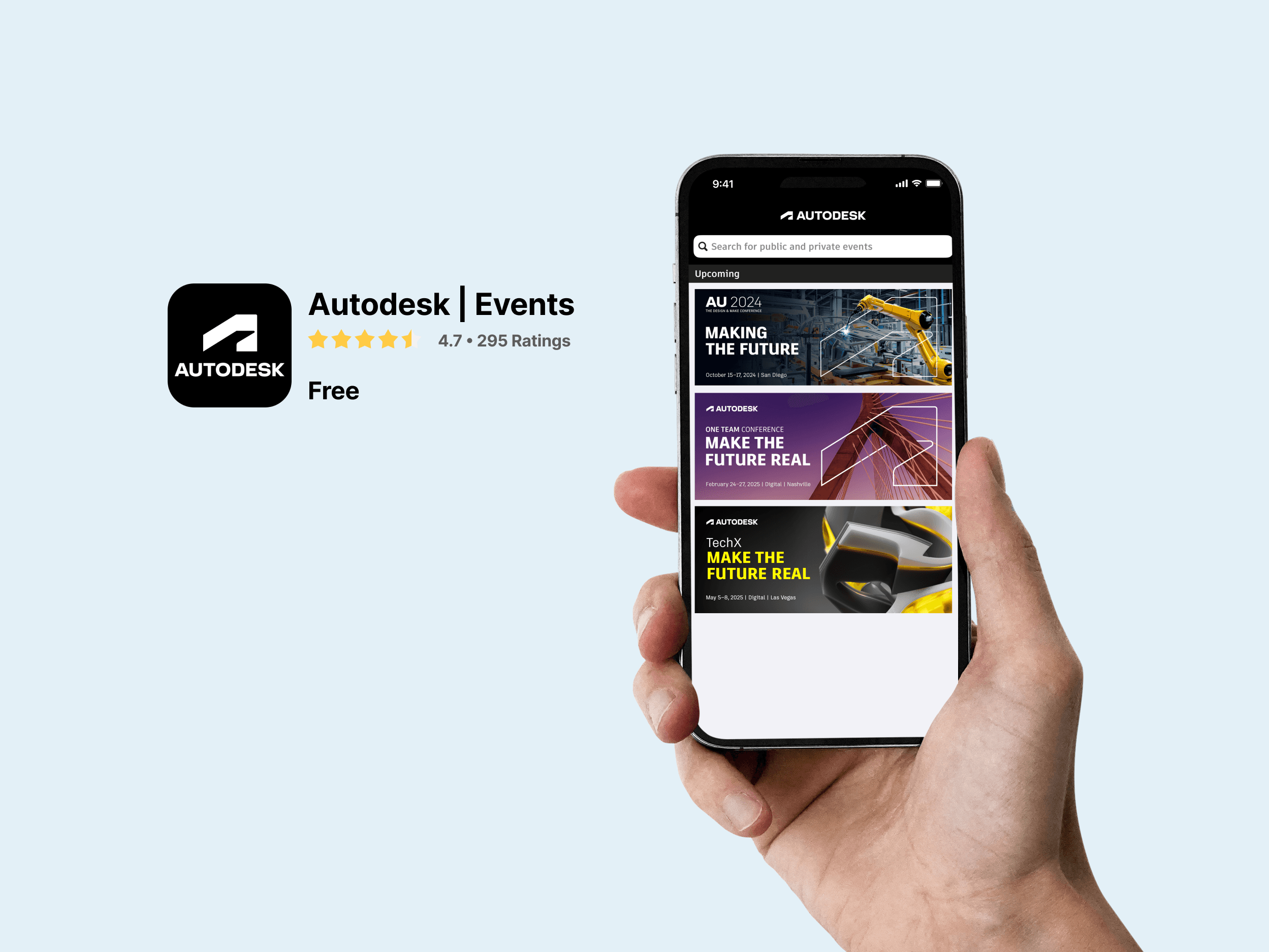
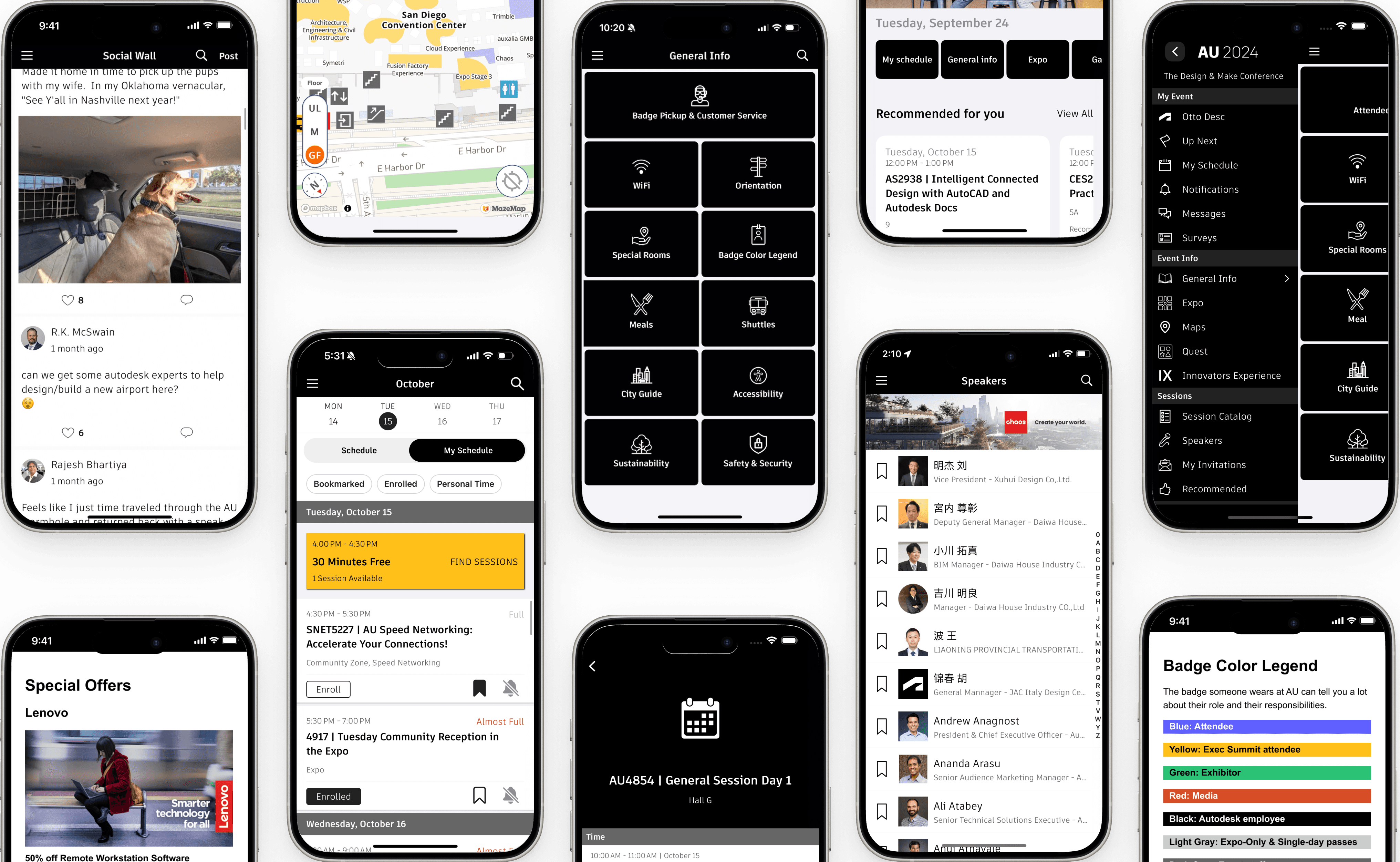
Autodesk Events App

Company
Autodesk
My Role
User Researcher
UI/ UX Design Lead
UX Strategist
team
Marketing Manager
Program Manager
UX Manager
Graphic Designer
Content Writer
Engineers
Timeline
Jun. 2022 - Feb. 2025
Background
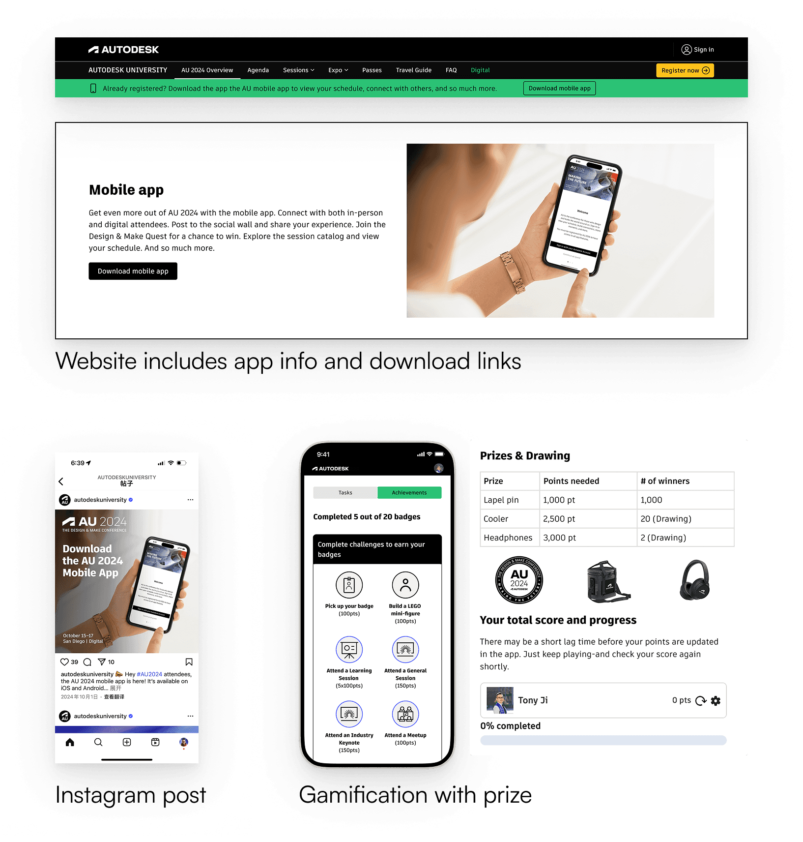
The Autodesk Event app is your go-to tool during the event, offering exclusive features at your fingertips. Use it for check-in, managing sessions, networking, navigating the venue, accessing quick event info, and getting real-time updates.
Challenges

Limited prior research insights

Only has 3 months to deliver
App platform with constraints
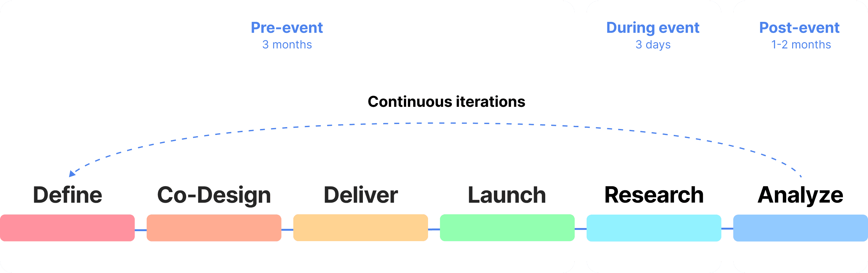
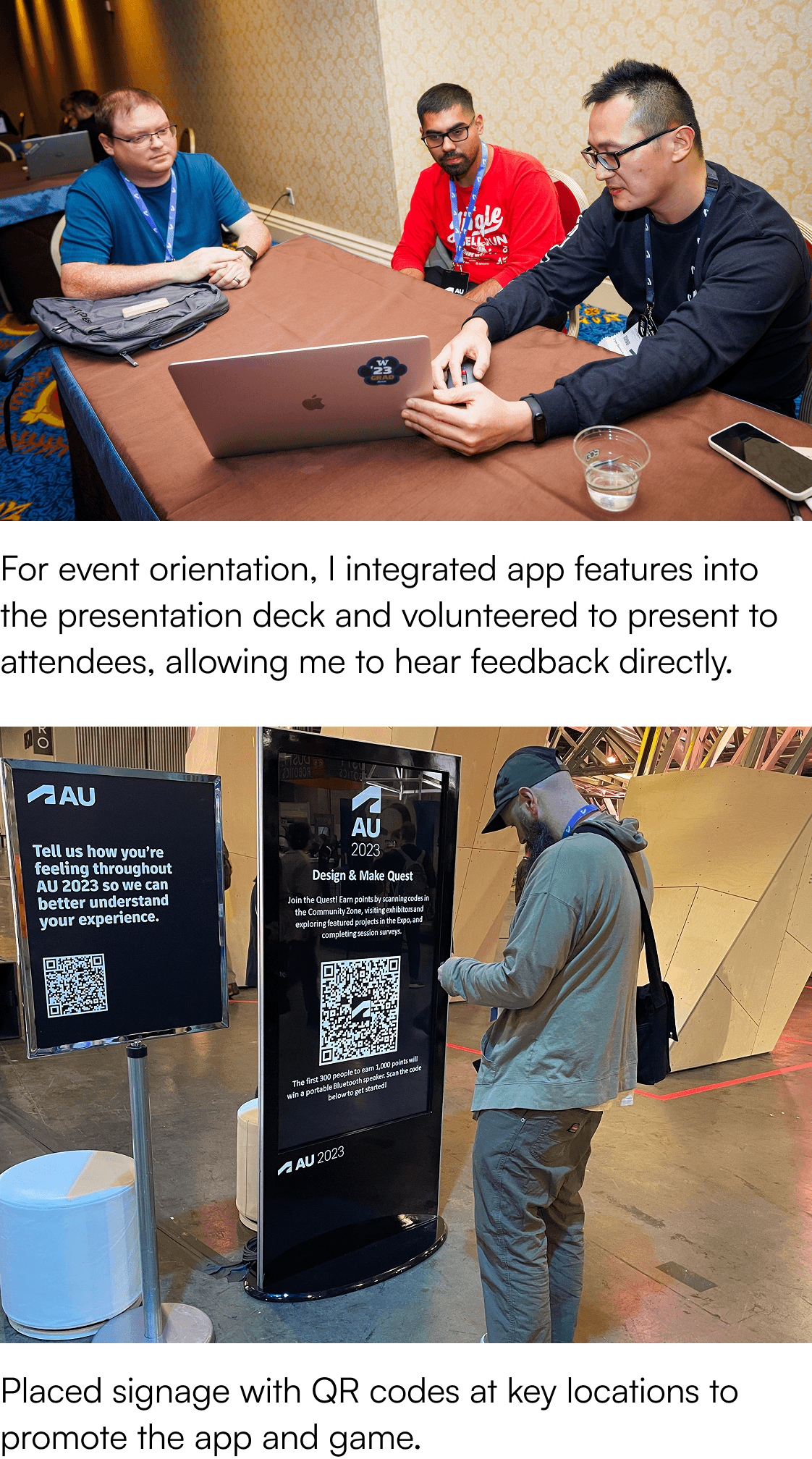
I refined the event app over six cycles, relying on real-time attendee feedback due to tight timelines and budget.
I aligned with internal stakeholders
Goals
Requirement
Constraints

Program manager

UX manager

Marketing team

Brand team
I aligned with the app tech provider
Understand app platform features, limitations
Learned best practices from similar events they supported

App tech provider

App features & limitations

Best practices from similar events
I applied the best practices and Jokob 10 usability heuristics, and co-designed with stakeholders to shape the initial information architecture, required content, and establish the look and feel.
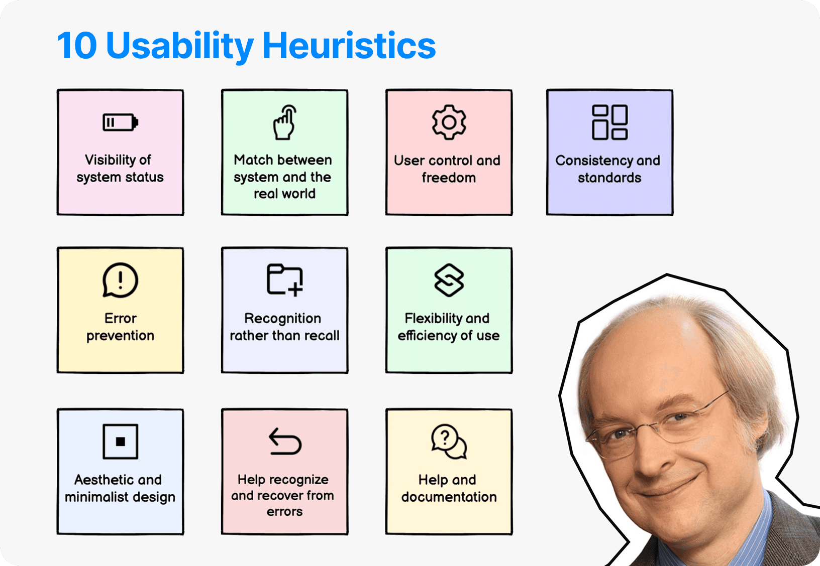
Jakob Usability Heuristics

AU branding guideline
I conducted real-time user research during the event—interviewed 17 attendees, facilitated a 10-person focus group using Rose, Thorn, Bud to uncover key issues and insights.
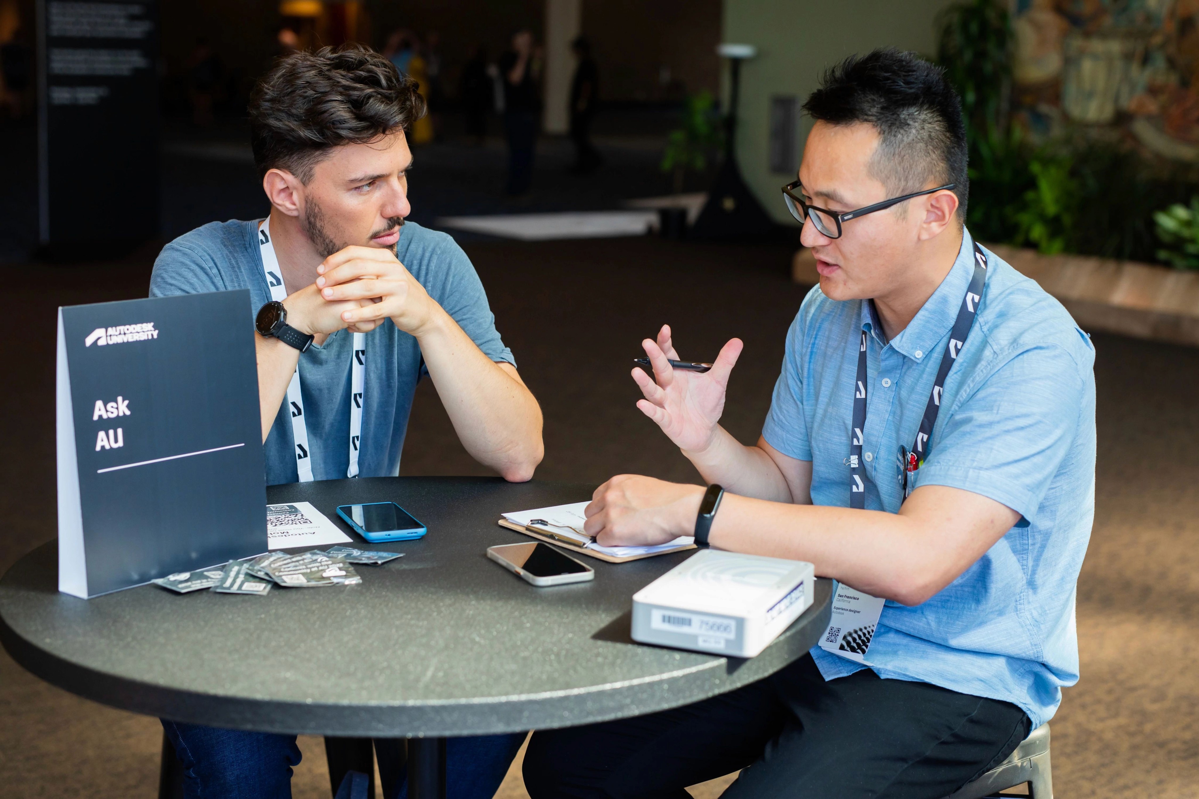
Interview
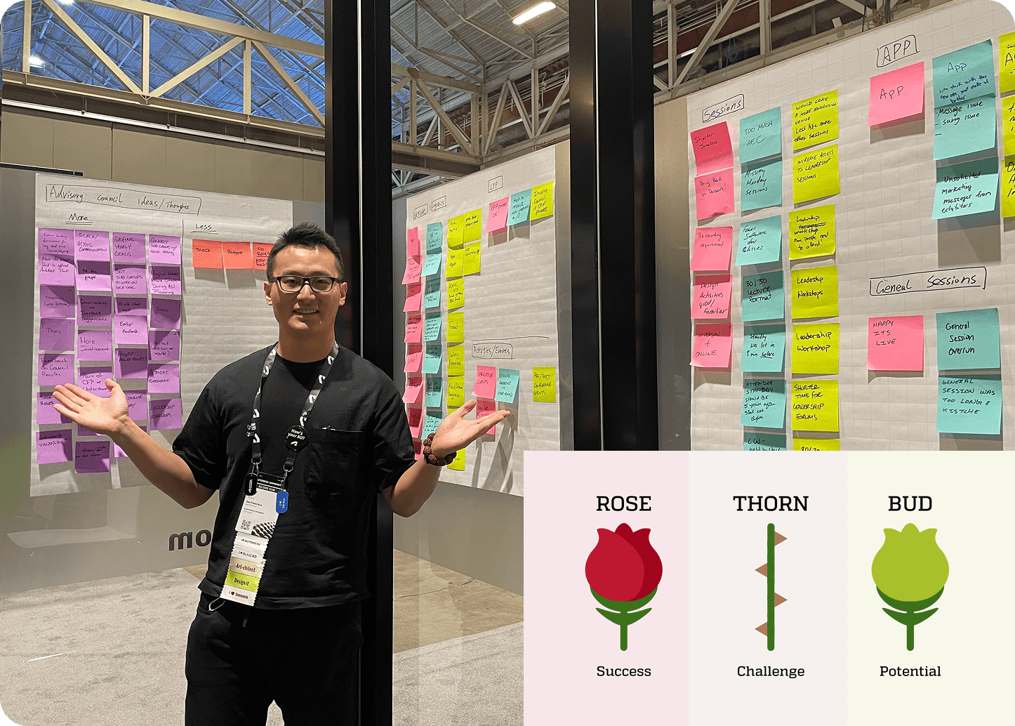
Focus group
After the event, I also analyzed survey results and app traffic data to better understand attendee behavior and experience.
App traffic throughout event

Survey feedback

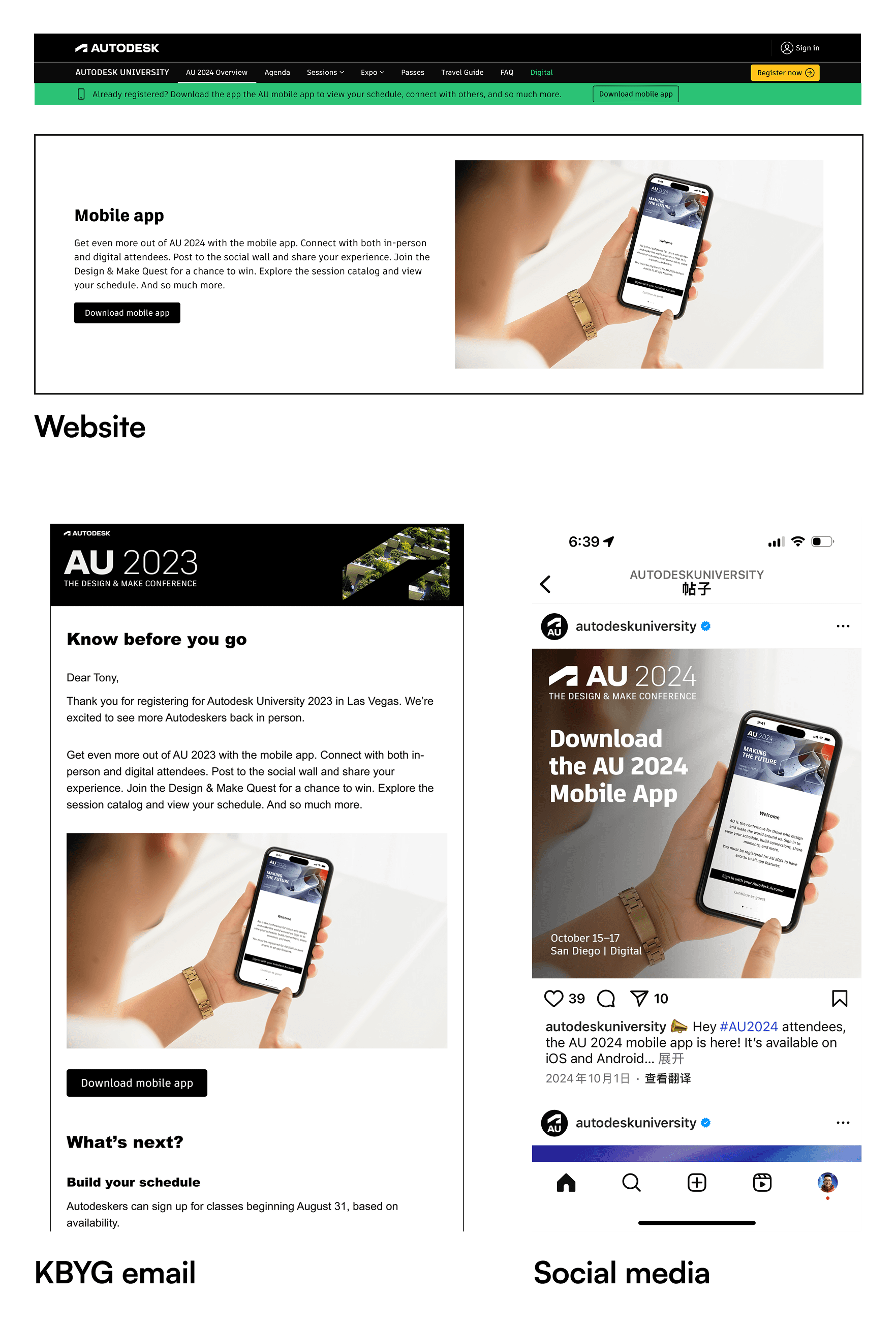
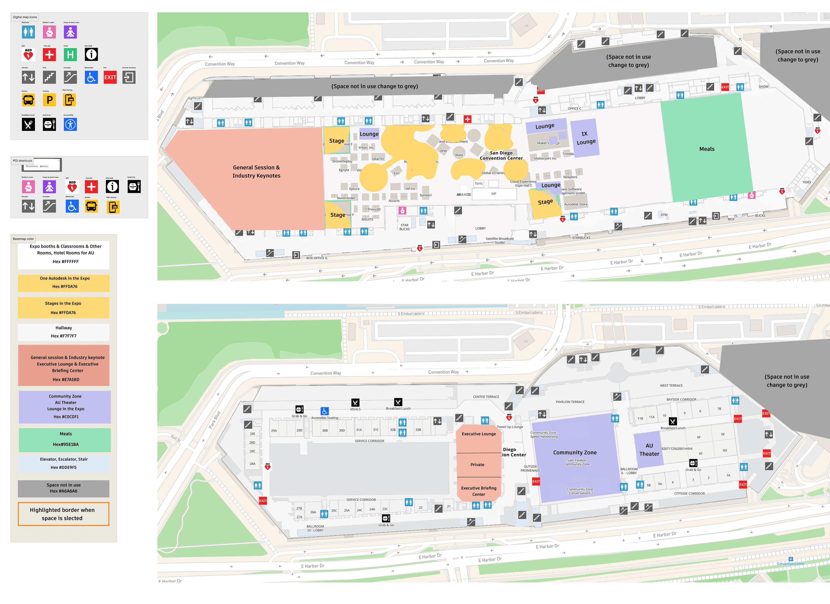
Low app & feature awareness

Complex navigation

Content overload
1. Low app & feature awareness
Many attendees—especially first-timers—didn’t know the app existed. Those who did mainly used it for scheduling or messaging, missing key features like the map and content pages.
The problem? Minimal promotion, both online and onsite.
“I don't think I know it (AU mobile app). Can you show me? ”
Attendee feedback

2. Complex navigation
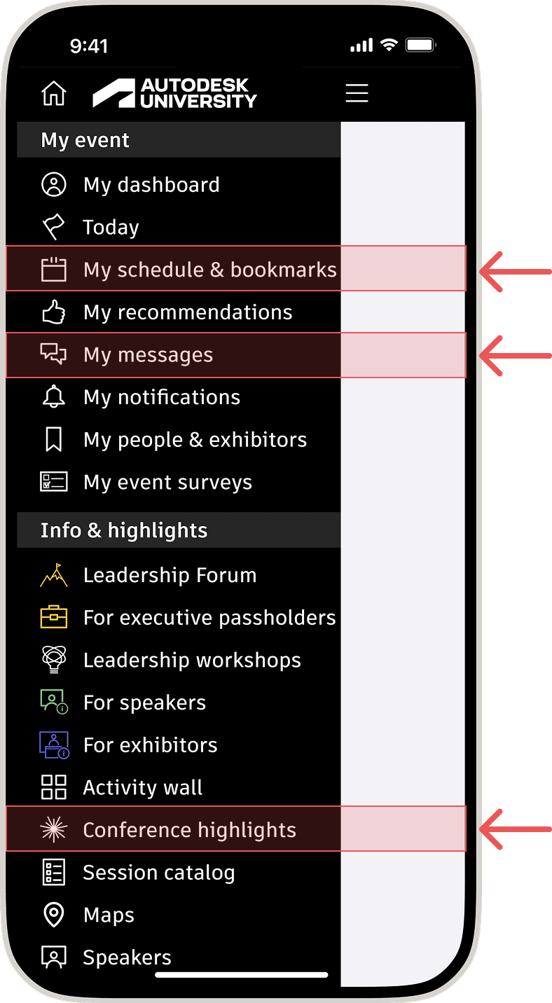
The 24-item side menu was overwhelming, attendees wanted a simpler menu with organized categories and subcategories for better navigation.
“There is a lot of stuff. .....there could be some subcategories too divided a little bit further. Because I'm a bit overwhelmed by it......So I feel like I want to lump something together. ”
Attendee feedback
3. Content overload
Certain pages became overly long due to redundant or repeated content requested by program managers, requiring excessive scrolling.
To address
Low app & feature awareness
To address
Complex navigation
Simplify navigation
The side menu was redesigned into five clearly titled sections, consolidating low-priority pages into submenus to improve navigation and reduce clutter.


To address
Content overload
Improve content strategy
Streamlined content with writers for clarity and readability, aligned it to attendee preferences, added anchor links for smooth navigation, and used CTAs to guide users while reducing repetition.


Keeping accessibility in mind, I designed the app and map UI to follow accessibility guidelines and added features like accessible route options with estimated travel times.
Map UI followed accessibility guidelines
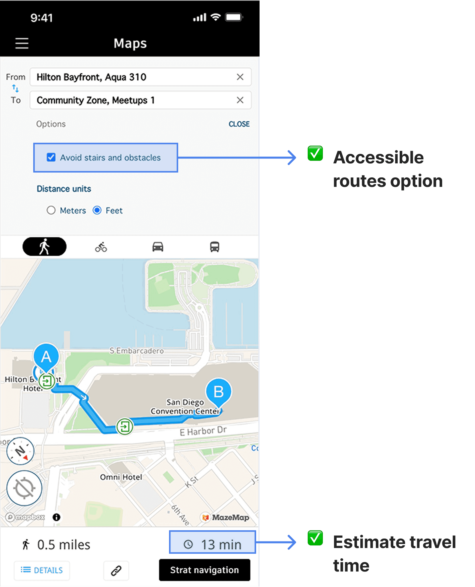
Included features that support accessibility needs
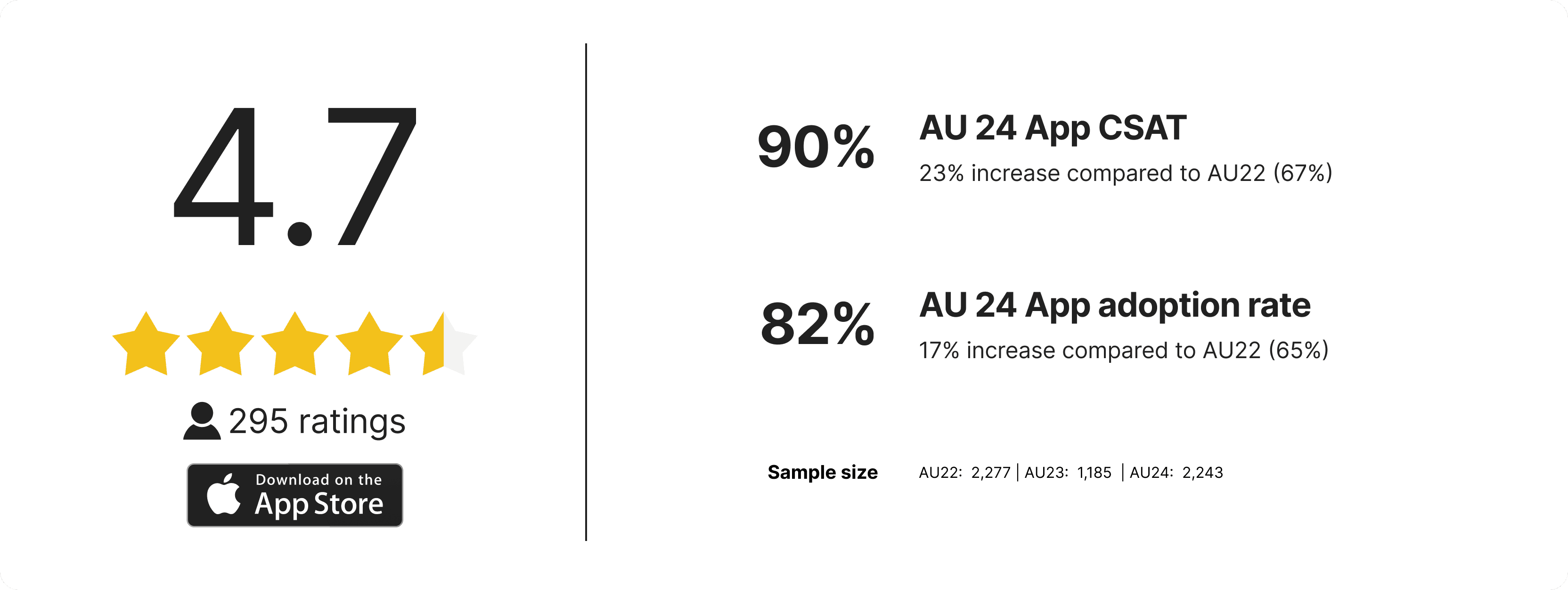
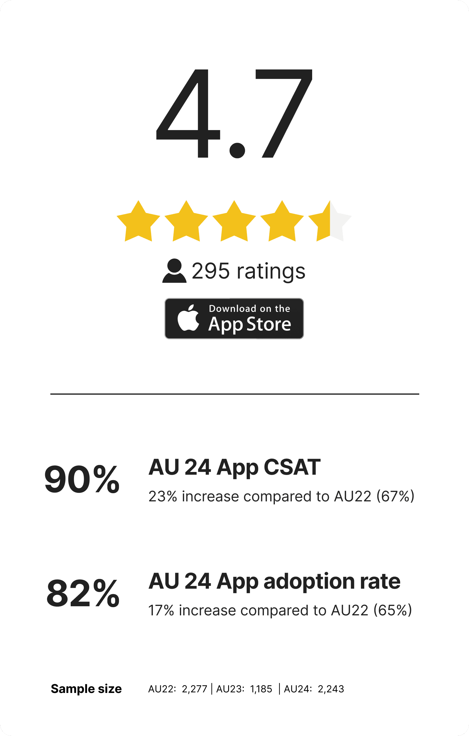
After two years of iterations, I successfully improved the app experience and boosted adoption rate.

What went well
Conducting on-site research with real users helped me quickly identify issues and understand how the app worked in context.

If we have more time and budget
Perform card sorting and usability testing before the app launch.

Takeaway
Design solutions often explore diverse touchpoints, using service design thinking can reveal more opportunities.