AU Conference Website Redesign
Company
Autodesk
My Role
User Researcher
UI/ UX Design Lead
UX Strategist
Team
Marketing Manager
Program Manager
UX Manager
Graphic Designer
Content Writer
Engineers
Timeline
Feb. 2022 - Feb. 2025
Background
AU is a 3-day hybrid conference with 50,000+ attendees. The website was the central hub for event info, registration, sessions, and recordings.
Why redesign?
Challenges

Juggle multiple tasks at once

AU 2023 & F1 happened the same week in Vegas.

Transitioned to a new website platform
The website redesign looks simple, but it covered 3 key stages—before, during, and after the event—and included 8 fast-paced design phases.

Conducted mixed-methods research with diverse participants to uncover attendee goals and pain points.
Participants
New attendees
Returning attendees
Methods

7 Usability tests
2000+ Surveys

17 Interviews


1 Focus group

Analytics
1. Quickly decide which pass to get.
Decide between a $2,000 in-person pass, offering hundreds of classes, networking events, an expo, and more, or opt for a free digital pass, giving you access to select class videos from anywhere.
2. Efficiently plan AU schedule to maximize 3-days.
Having invested money and time and traveled far, attendees want to fully pack their schedules within just three days!
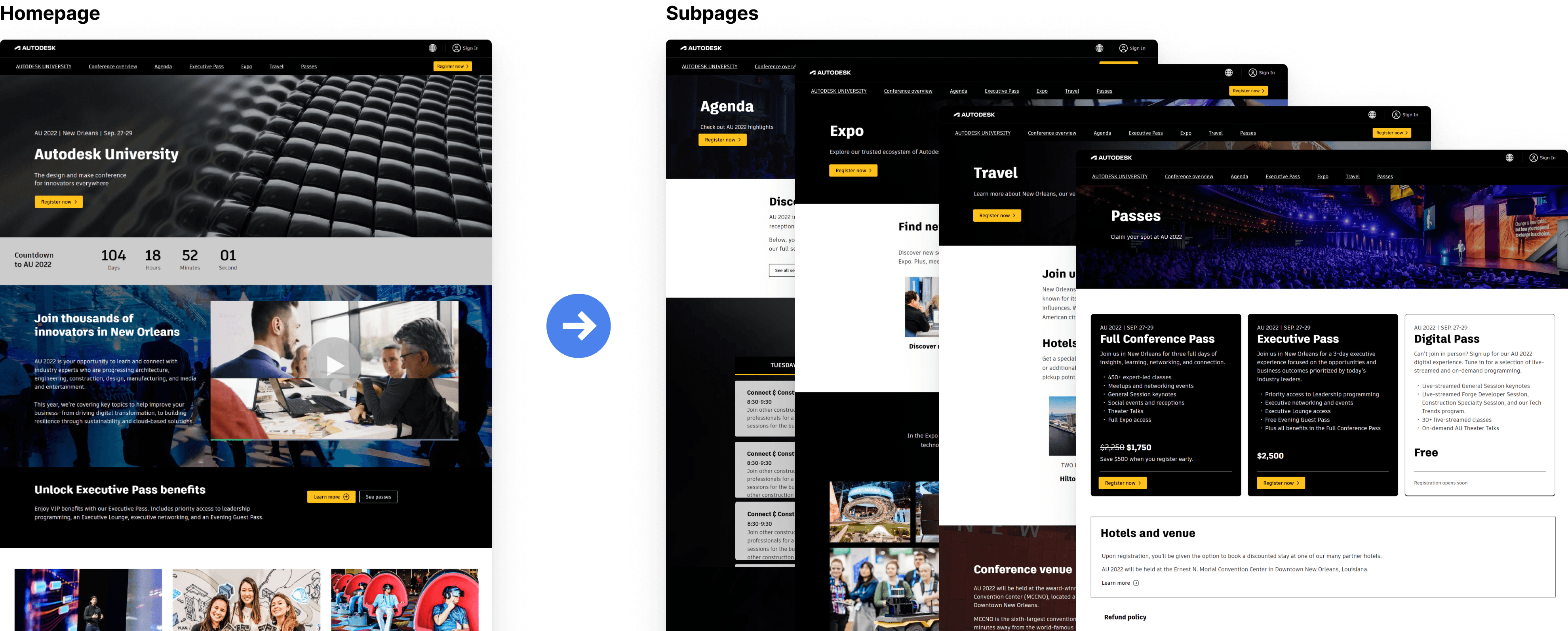
1. Attendees began on the homepage, then navigated to subpages for more details.
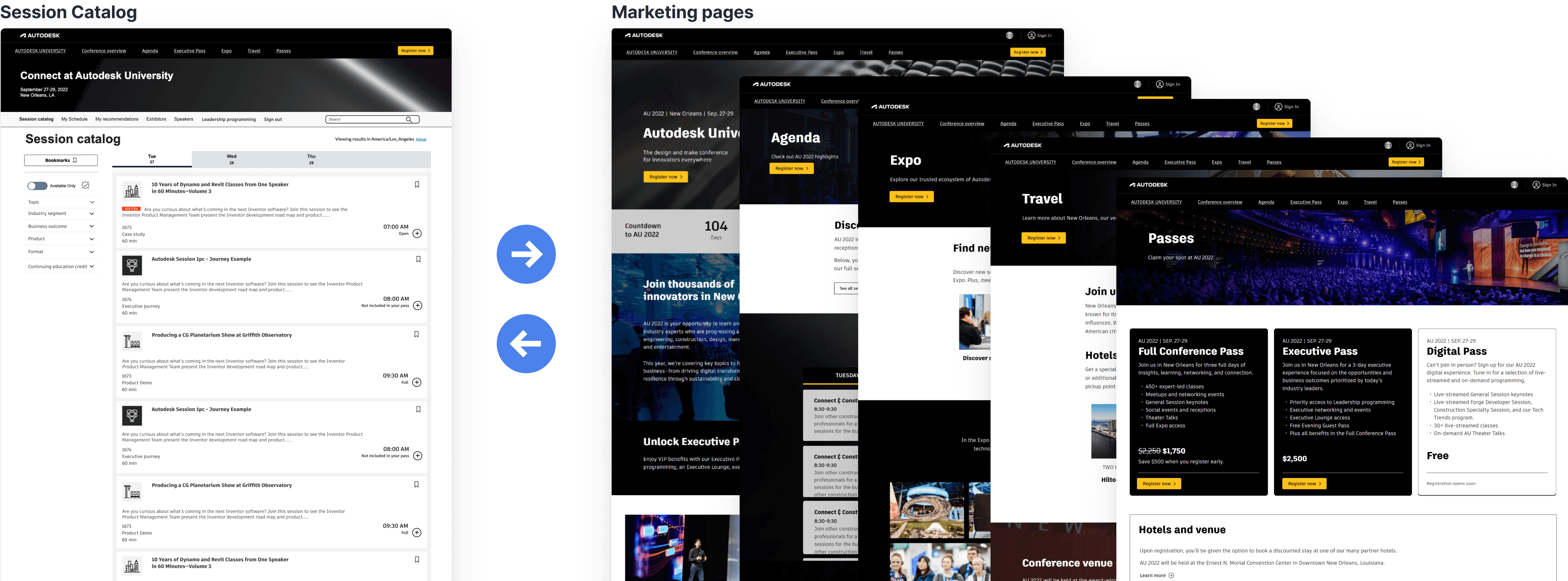
2. Attendees often jumped between catalog and marketing pages to plan their AU schedule.

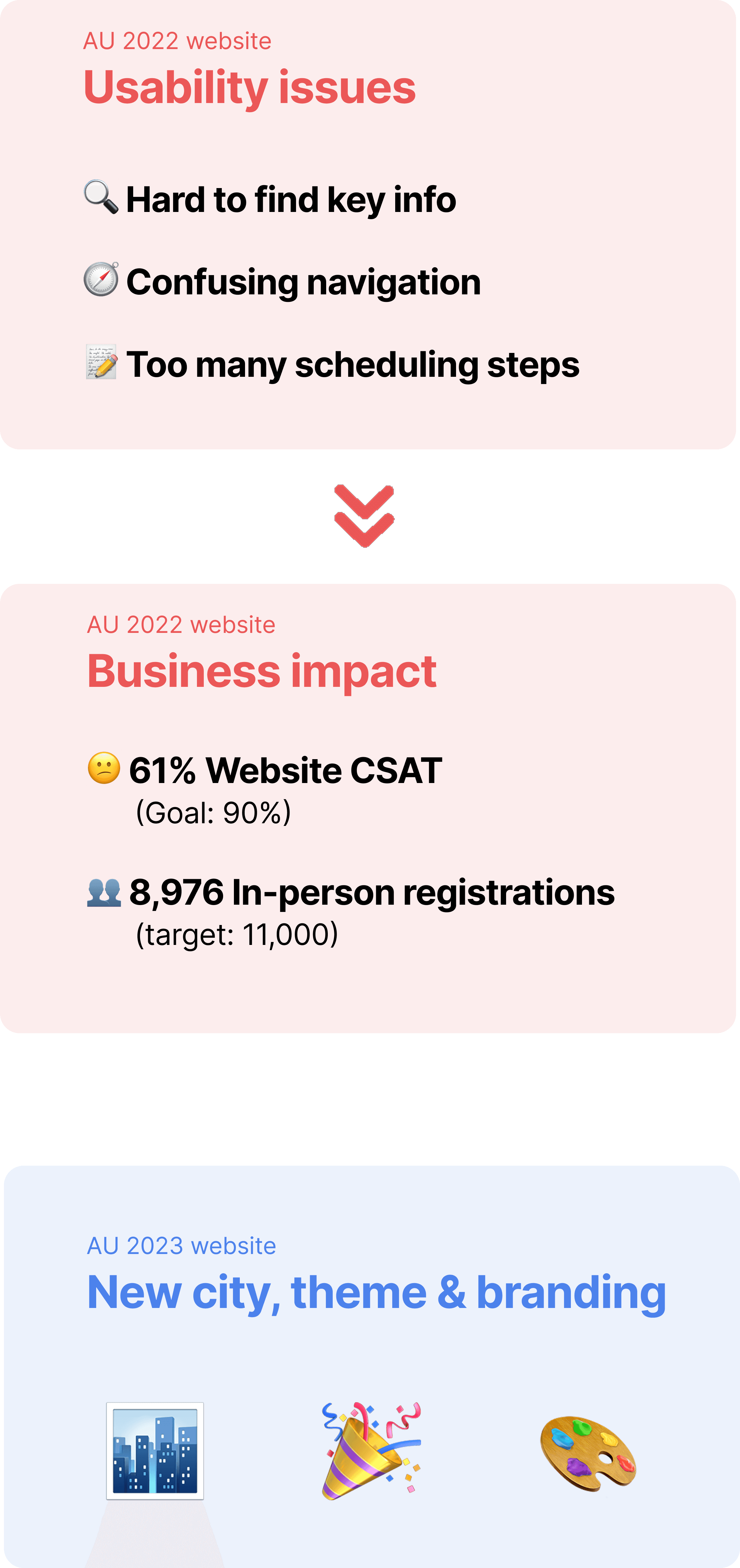
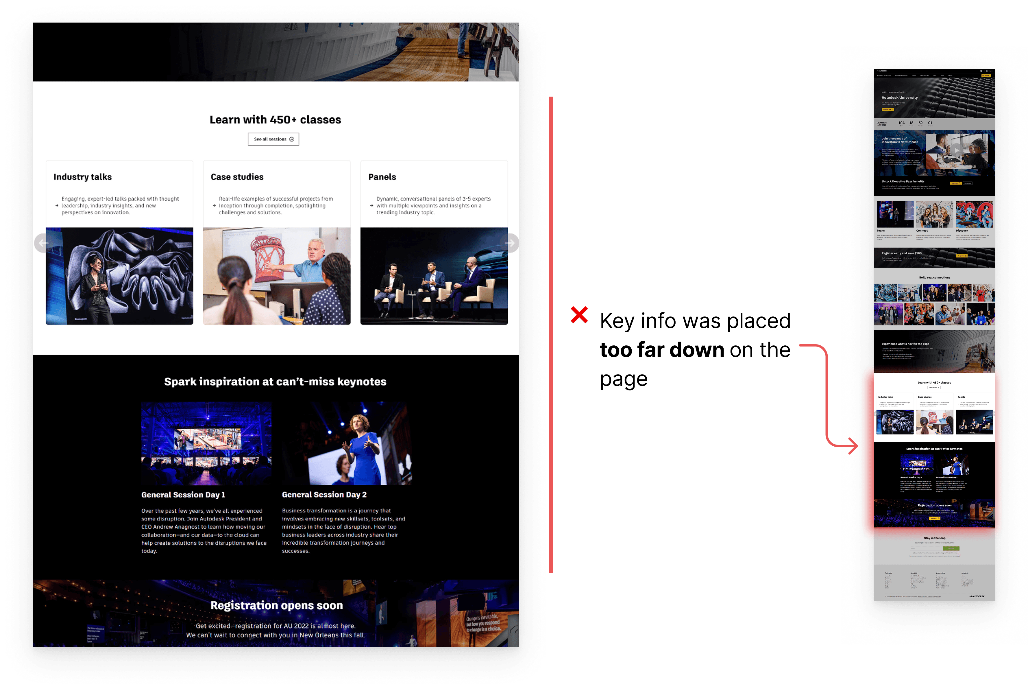
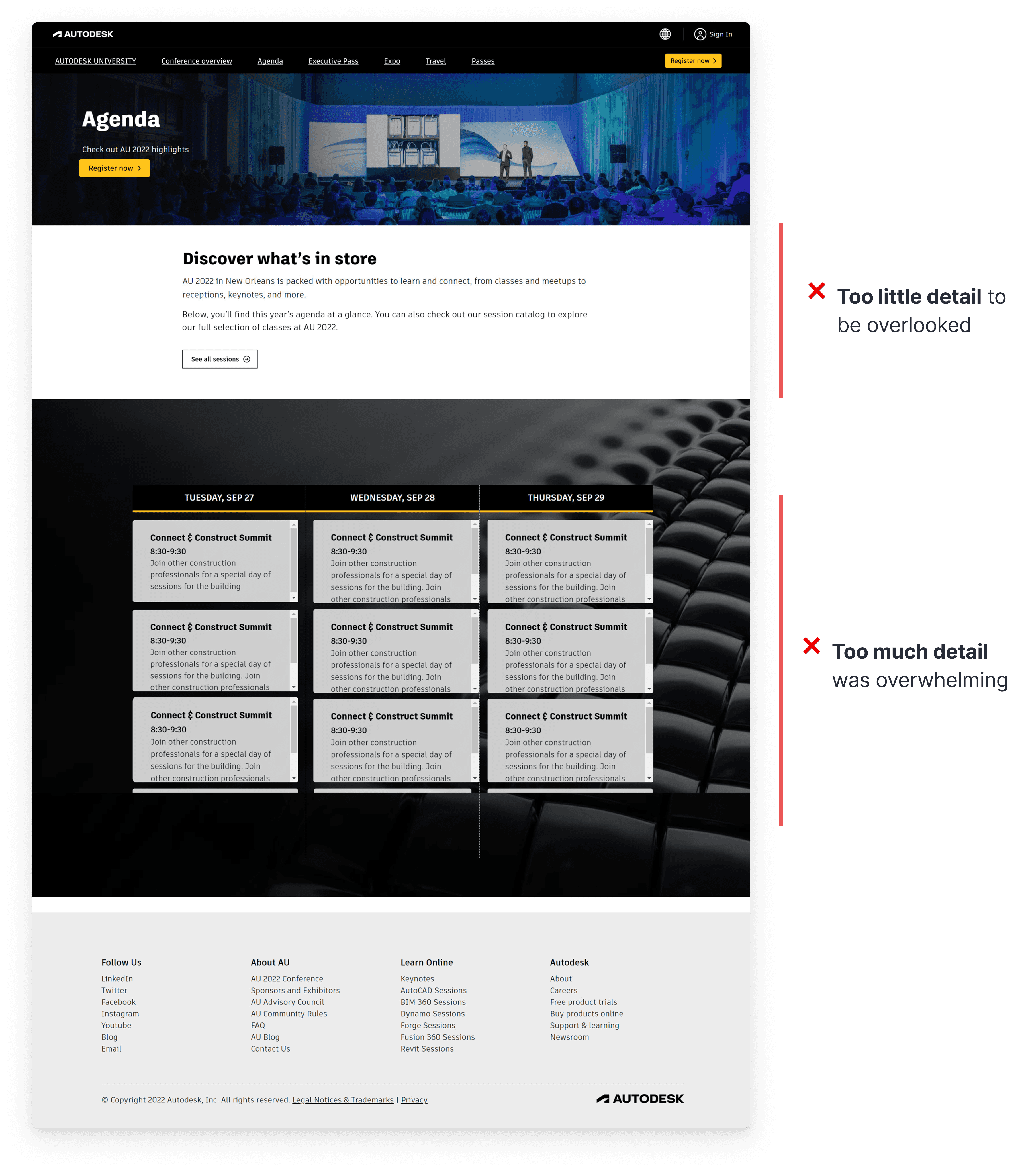
Key event info was hard to find on the page to inform decisions

Confusing navigation & too many steps make scheduling inefficient
Same issues across all Marketing pages
2. Confusing navigation & too many steps make scheduling inefficient.
The old session catalog had two separate navbars that weren’t sticky, taking up space and causing attendees to miss the top menu while scrolling, disrupting flow and frustrating decision-making.
Attendee needed to navigate a complex maze—searching, filtering, switching tabs, and browsing through hundreds of sessions.
How might we make the key info easy to find to inform decisions and simplify scheduling for better efficiency?
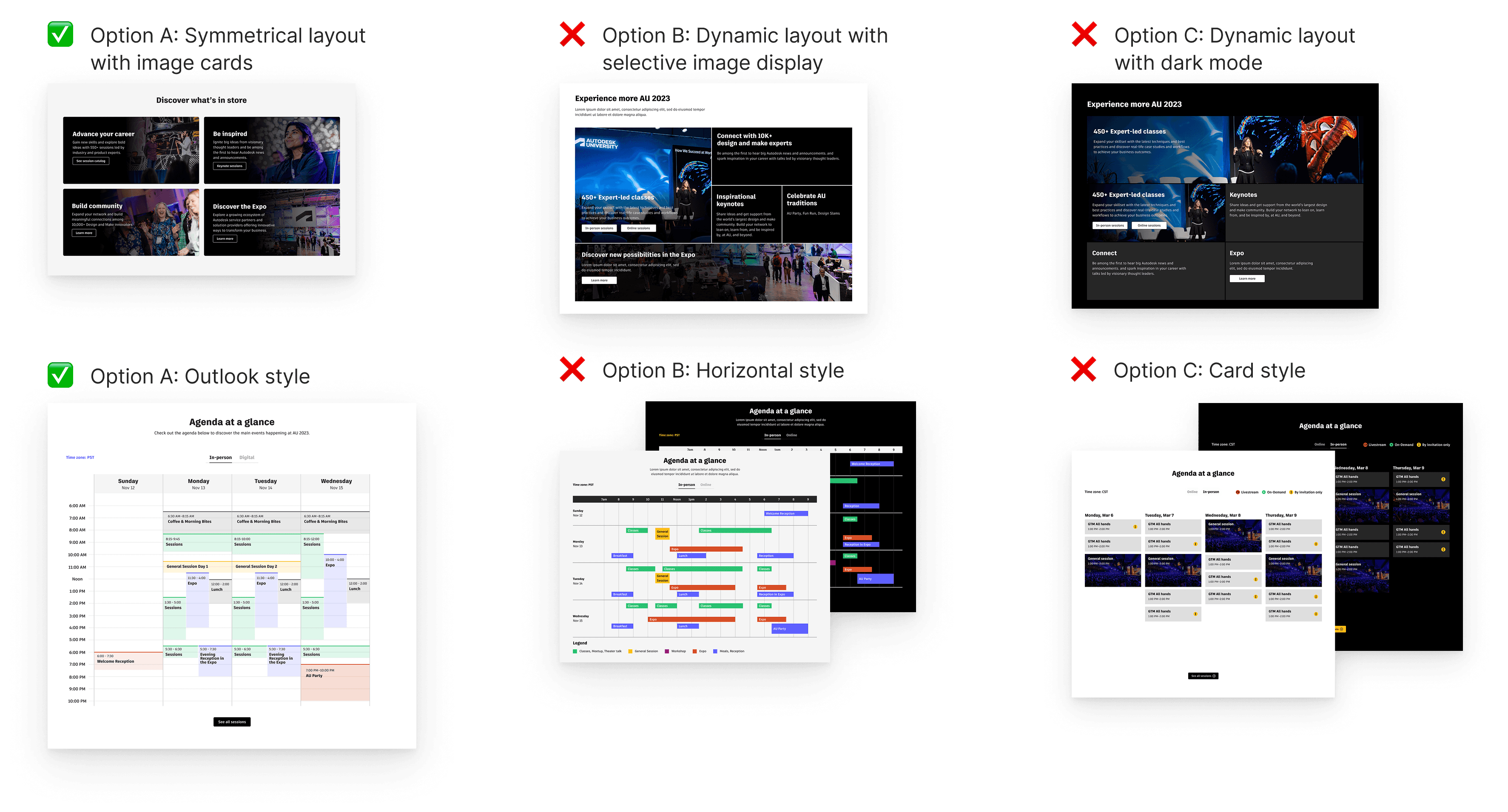
We began by establishing design principles as our guiding star, adhering to the AU design guidelines, and refining the design through concept testing on navigation, layout, and key elements.
Design principles

Clarity

Consistency

Responsiveness
AU Brand & accessibility guidelines
Concept testing
To address
Key event info was hard to find on the page to inform decisions.
To address
Before
After
After two years of iteration, I improved the attendee experience, achieved a 90% CSAT, and helped reach the in-person engagement goal of 11,000 attendees.
Website CSAT
# In-person registrants
My successful redesign led to reusable Figma templates, supporting 100+ smaller event websites.

What went well
Concept testing provided valuable design direction, even without conducting usability testing for the new design.

If we have more time and budget
Conduct usability tests to find evidence-based solutions

Takeaway
The AU website is a small part of the attendee experience but plays a key role in the event’s success.


